DIY-ing your own website can be tough, especially if you’re not sure about the strategy behind designing a scroll-worthy website.
If you haven’t been getting any leads or captivating your target audience lately, you may be missing one (or all 😳) of these 5 things on your website homepage.
HOMEPAGE TIP #1:
Captivate your audience above the fold
Right when your audience lands on your website, you’ll want to captivate them immediately. I’m talking like 10 seconds…
Nothing makes me click out of a website so fast if I have to scroll and scroll and scroll……just to find out what the heck this business does and how they can help me.
We need to grab our reader’s attention above the fold.
“Above the fold” is a term used to describe the area you see before you ever scroll down on a website. It’s what your audience will see first.
If you’re a service provider, you’ll want to make sure you’re stating who you are, what you do, who you help.
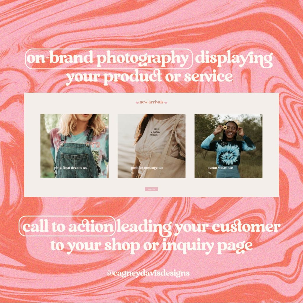
If you’re a product based business, you’ll want to showcase your most popular or recently added products.
HOMEPAGE TIP #2:
Make sure your brand photography matches the vibe of your brand

On-brand photography is crucial for brand recognition. You’ll want the photos to have the same look and feel as your current branding has.
Nothing is worse than having branding you’re obsessed with…just to ruin it with photography that doesn’t match the same vibe.
If you aren’t ready to have your own brand photoshoot, scroll through some stock-free images that relate to the content on your website. My go-to site for stock images is Pexels!
HOMEPAGE TIP #3:
Have a section about you or your brand story

When you leave your audience wanting more, they’ll dive deeper into your website. Doing this will attract more leads & we all love that, now don’t we?
It’s important that you realllly captivate your audience here, too (& all throughout your website). But, especially here because the about page is one of the most top viewed page on a website. Yup, you heard that right.
The amount of times I’ve gotten frustrated when there’s not an about page on a company website is endless.
Helllllllooooo people buy from people. If I can’t learn about the owners & team, sorry, I’m just not that interested about anything else.
HOMEPAGE TIP #4:
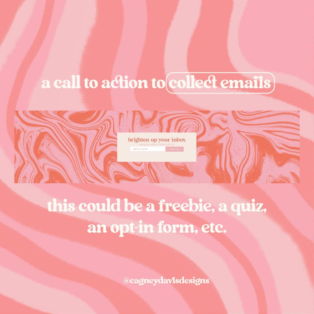
Collect those emails!

Raise your hand if you don’t think newsletters are dead. I know I’m raising my hand over here in my lil’ home office!! Now, maybe newsletters aren’t your thing….yet. But, they realllly should be.
Your email is the only thing you truly own. If you’re solely relying on Instagram & it goes down…guess what? Your business is totally SCREWED. How are you going to reach out to your audience?! Real food for thought there.
HOMEPAGE TIP #5:
An on-brand footer for all your navigation needs

A footer is crucial to any page on your website, not just your homepage. Make sure you have all your navigation plus all the extra stuff.
Yes, we’re talkin’ about all the boring policies, terms and conditions, & legal stuff.
It may be a snooze fest, but it’s definitely worth putting on there to save your butt in the long run. This is another great place to put that handy dandy newsletter opt-in form!
Alright, how do you feel?!
Do you think you can tackle this on your own?
If you’re not feeling confident in your website & feel like it needs a full over-haul, I’ve got you! As a branding and web designer, I’m totally obsessed with getting passionate, creative business owners confident in their business again. Let’s infuse your website with the personality it deserves.
