When designing your brand identity, I give you allllll the bells & whistles. From logo designs (duh) to brand elements, patterns, photography direction, brand guidelines, & more.
My goal is to get you damn confident in yourself and your business. And, sure, designing a brand you & your target audience are obsessed with is important. But, arguably the most important part is making sure you know how to use your brand correctly.
WHAT IS A BRAND PATTERN?
If you’ve never gotten your brand identity professionally designed, the word brand pattern might feel a bit foreign to you.
Sidenote: let’s get one thing straight, not every brand needs a brand pattern. So, if you’re sitting there already obsessed with your brand, but now you’re freaking out that you don’t have one. Do not fret.
The visual identity of your brand depends on soooo many things. Such as:
- Who’s your target audience?
- Are you a product, service, or both?
- What social media platforms are you on?
- Do you host events? Art Markets?
- What print collateral will your brand have? Business cards, packaging, menus, service guide, etc?
- The list goes on…
A BRAND PATTERN IS A SUBTLE WAY TO ADD IN YOUR BRAND ELEMENTS & COLORS. TYPICALLY USED FOR VISUAL IMPACT IN BACKGROUNDS.
So, you know what a brand pattern is, but how the heck do you use it effectively? You may love your pattern soooo much that you wanna slap it on everything. Let’s…not do that.

Top 3 ways to use your brand pattern

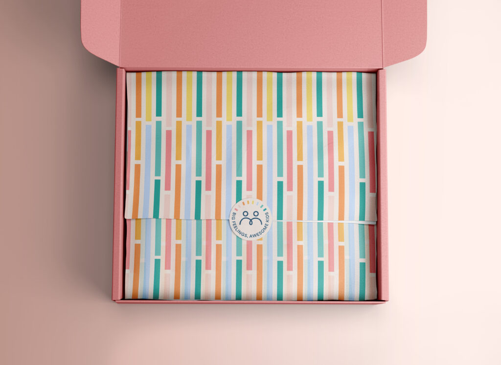
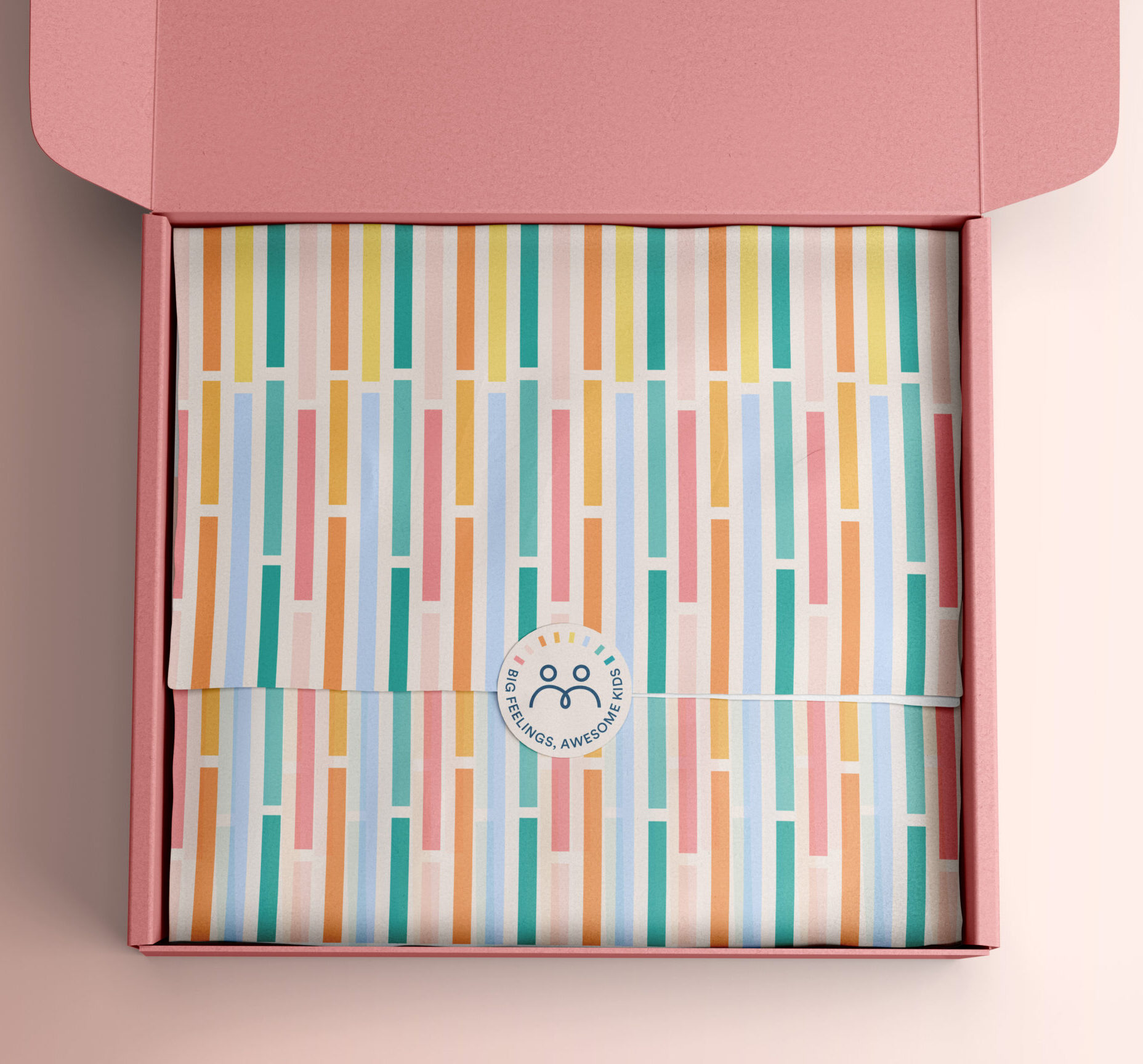
PACKAGING
If you’re a product based business, packaging is the perfect place to display your brand pattern. It’s your way of showcasing your client experience & something you definitely don’t want to neglect.
You ever get a package on your doorstep wondering who the heck it’s from? I’m sitting there thinking, what did I order this time while I pick up the package and read the tiny little letters that show the business name on the return address.
You were so excited to buy the latest product everyone is obsessing over on TikTok only to be disappointed once you open up the package.
The product is just thrown in the poorly branded box. And truthfully, you’re not even surprised at this point. Just…disappointed.
Now this isn’t a diss (or is it? 👀) at these businesses, but come on. Don’t spend all this time marketing your product only for your packaging to suck.

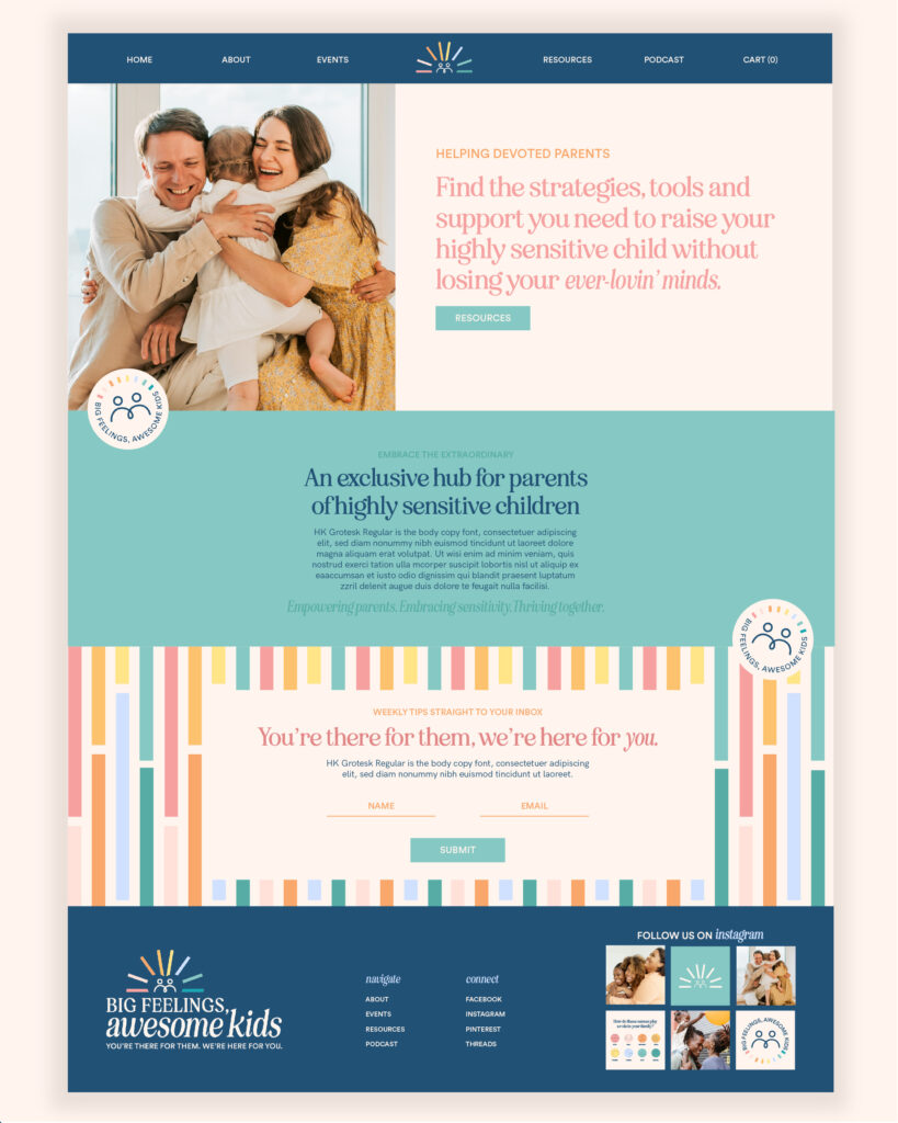
NEWSLETTER OPT-IN FORMS
One of the easiest ways to show off your brand pattern is making it the background to your newsletter opt-in form!
It’s so subtle & cute!! And, like the definition early said, adds in the visual impact.

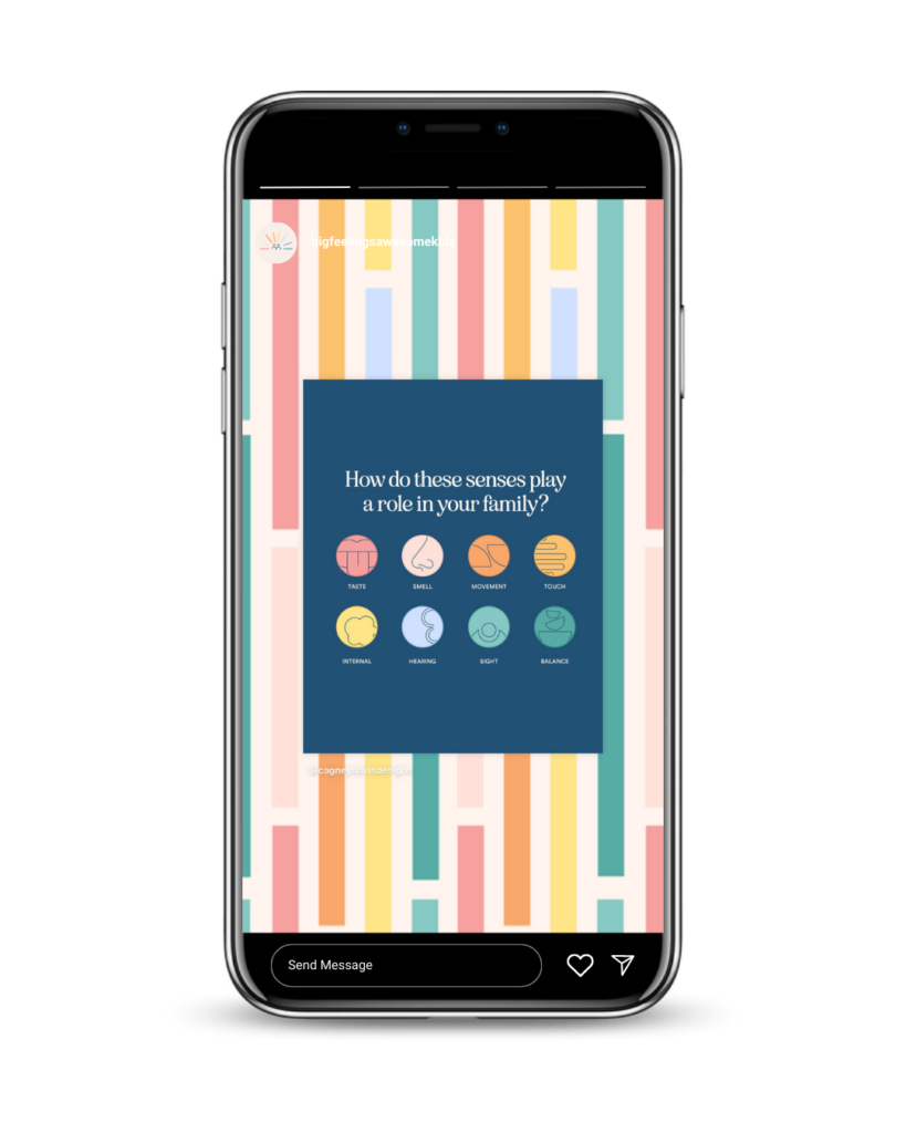
SOCIAL MEDIA TEMPLATES
Use your brand pattern in social media templates, especially as Instagram story backgrounds!
These are such a cute way to add in your branding on social media. Rather than just making your story background a plain brand color (which totally works too!), add in some visual interest by showcasing your brand pattern.
Don’t even have a brand identity for your business yet?
Looks like you came to the right place! Hi, I’m Cagney! A bold, personality-packed brand and web designer who loves working with passionate creatives like you.
