We’ve all been there. The dreaded feeling of having to post on Instagram again. After not posting for months….again.
Now, I’m no social media guru who’s gonna tell you “make these reels a 5x a day because you’ll definitely go viral”
But, I am a brand design guru who can help make designing the posts feel 10x easier and make your feed feel like a full brand experience.
That way, when people see your posts, there’s no denying it was made by you.
How to make your instagram so on brand
STEP 01.
USE INSTAGRAM POST TEMPLATES TO YOUR ADVANTAGE
I’ve said it once and I’ll say it again. Use 👏 social 👏 media 👏 templates 👏 to 👏 your 👏 advantage! It’s saves me sooo much time when designing new posts.
Canva is a great tool for this (make sure you get the Canva Pro version so that you can upload your brand fonts!).
Canva has loads of templates to choose from if you don’t want to worry about designing your own. The templates have truly gotten so much better over the years and you’re bound to find one that feels on brand style wise.
Just swap out the fonts, colors, and images and boom! You’ve got a new template to use for your Instagram.
*Note: Try to stear clear of the Canva templates that you often see alllll over Instagram. Some are so obviously designed on Canva & lack that customized touch.
If you decide to not go the template route, at least set up a few (about 5-7) different types of ways you like to design your posts!
For all texts posts, set up your type hierarchy rules. Headers are always this size, body copy is always this size, etc.
This adds in some design consistency while not having specific templates you have to use. More like having a social media style guide if you will.
STEP 02.
PLAN OUT YOUR INSTAGRAM FEED IN ADVANCE
The biggest tip for making sure your feed feels on brand is by planning it out!
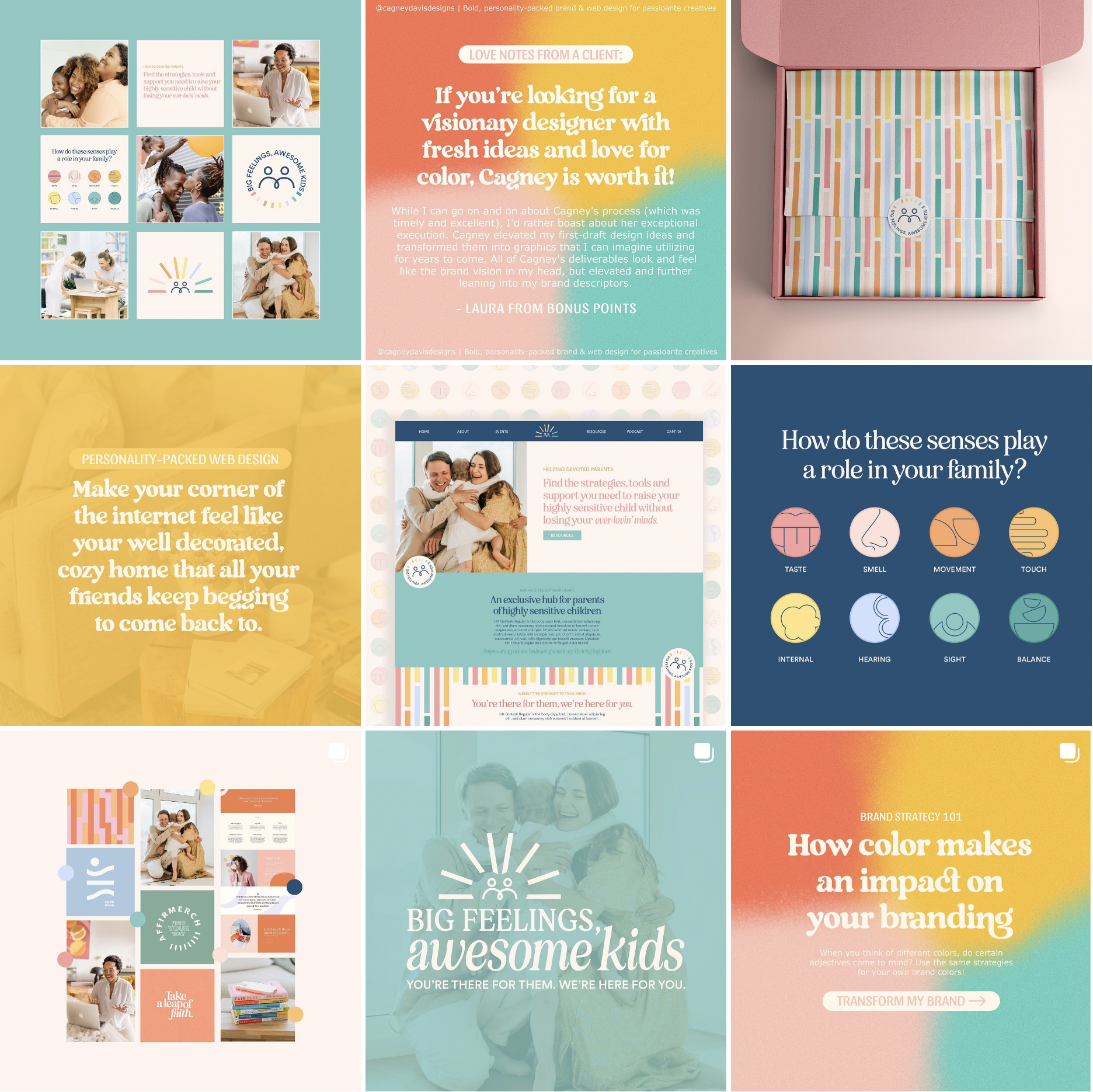
By doing this, you can see how all the colors pair together. If any colors are clashing next to each other. If there’s enough variation is the posts, etc.
My favorite free app to do this on is Planoly. You can even schedule the posts and pre-write the captions!

Let’s check out this example above! See how there’s a variation in the posts without looking tooo templatey?
My brand colors are repeated through out the feed but spread out rather than being right next to each other.
STEP 03.
DON’T NEGLECT YOUR INSTAGRAM HIGHLIGHT COVERS
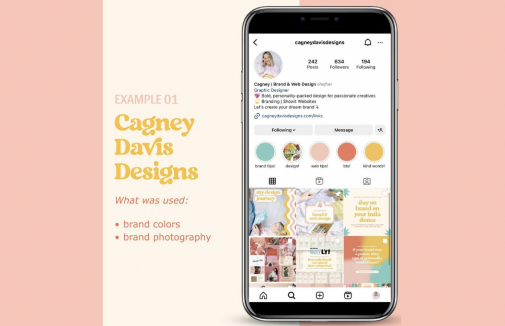
Bring your brand to life with the way you design your highlight covers! You’ll also want to organize your highlights by your main content pillars (subjects you repeatedly talk about – mine are brand tips, web tips, resources, kind words, design, how to work with me).
There’s plenty of ways you can bring in that branded experience to your highlight covers. You could use:
- Custom Branded Icons
- Brand Color Palette
- Brand Patterns
- Brand Photography

STEP 04.
BE INTENTIONAL ABOUT YOUR PINNED POSTS
Pin the posts you want your target audience to see right away! Think about your client’s journey and what steps it may take for them to purchase your product or offer.
Types of posts to pin:
- About you or your business – People love a story! It builds connection and trust.
- Services you offer – Make it known what you offer before they even click on your website! This should clearly stated in your bio as well.
- FAQs – If there’s any questions you get repeatedly asked, make a post about it & pin it!
- Product Sales/New Collection – Have specific promotions you’re trying to advertise? Pin them!
My pinned posts are about me & the services I offer 😊
