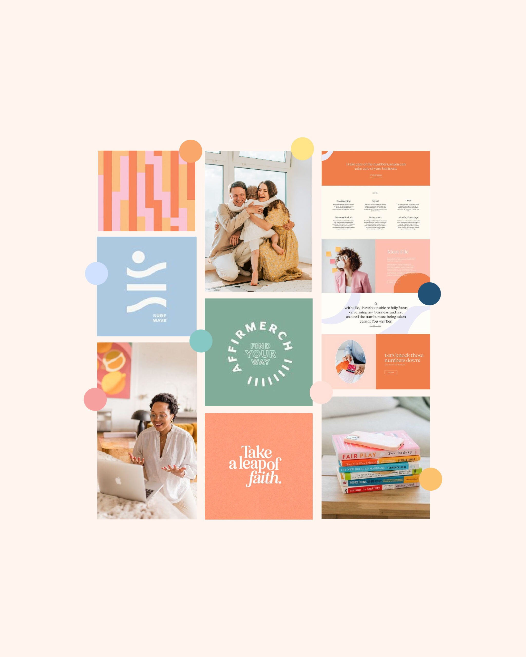
You know what time it is, friend! BRANDDDD DEEEEP DIVEEEE TIMEEE!
I’ve wrapped up another branding project & it’s time to show you the ins & outs on how I created it. From mood board to a fully developed brand identity!
This one was a bit of a challenge, not gonna lie. We wanted to find a perfect balance of sophistication & fun. Cue One, Two Step by Ciera: “I’m sophisticated fun 💅”
Not leaning too juvenile, since after all, this business is for the parents not the kids.
BRAND IDENTITY VIBE:
FUN, INSPIRING, SOPHISTICATED
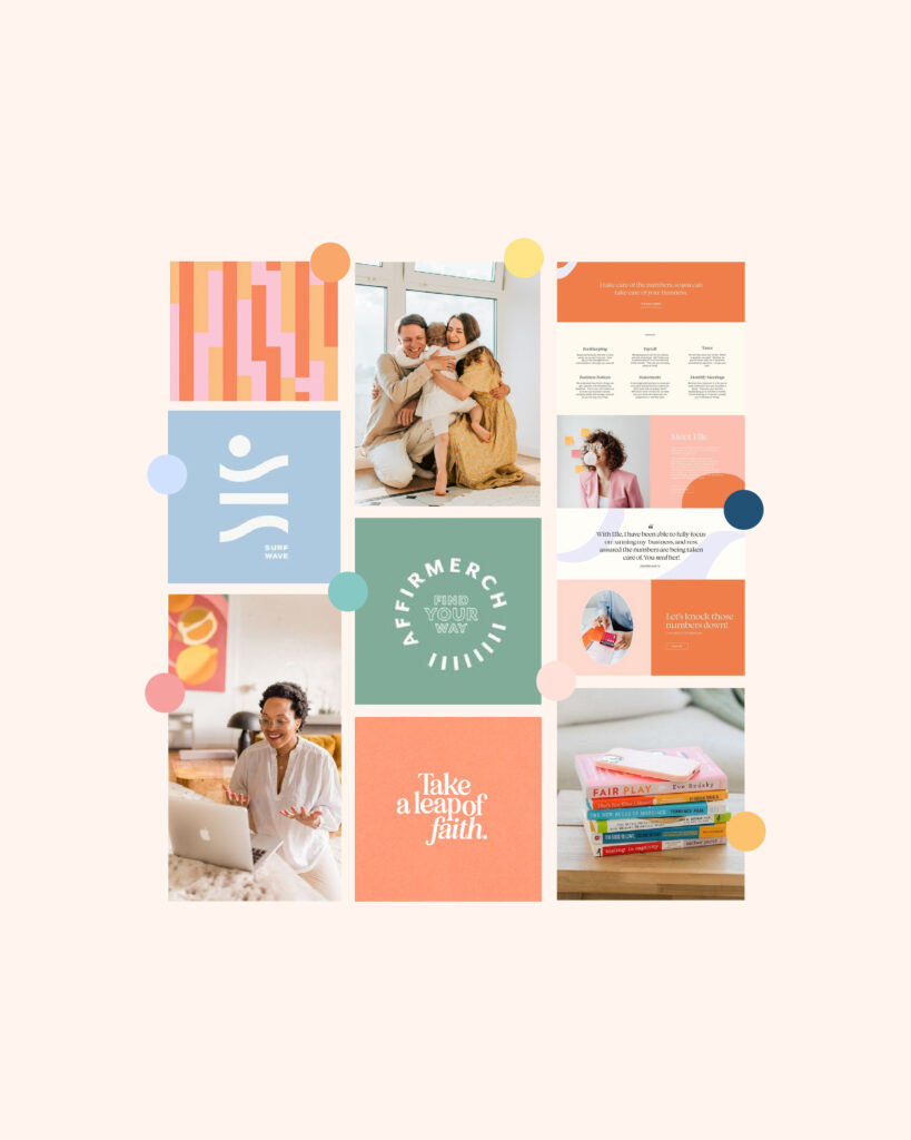
When researching into her industry competitors, it was clear there was an over saturation of certain looks. Let’s take a look at what’s happening too much in the industry:
Let’s stay away from:
- Focus too much on how to help the kids rather than the parents
- Overly Juvenile
- Scientific jargon
So, how would we solve this?
- Lean into the fun pops of color & balance it out with navy to bring in that sophisticated touch
- Be approachable!
- Focus on the parents rather than the kids
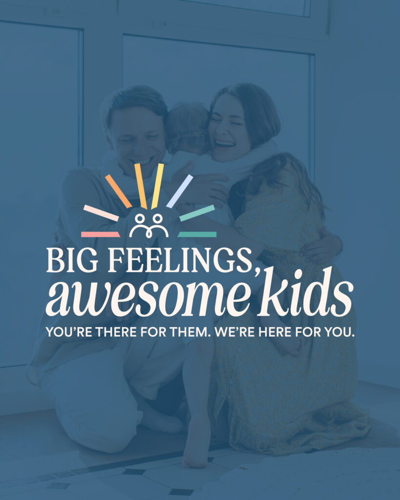
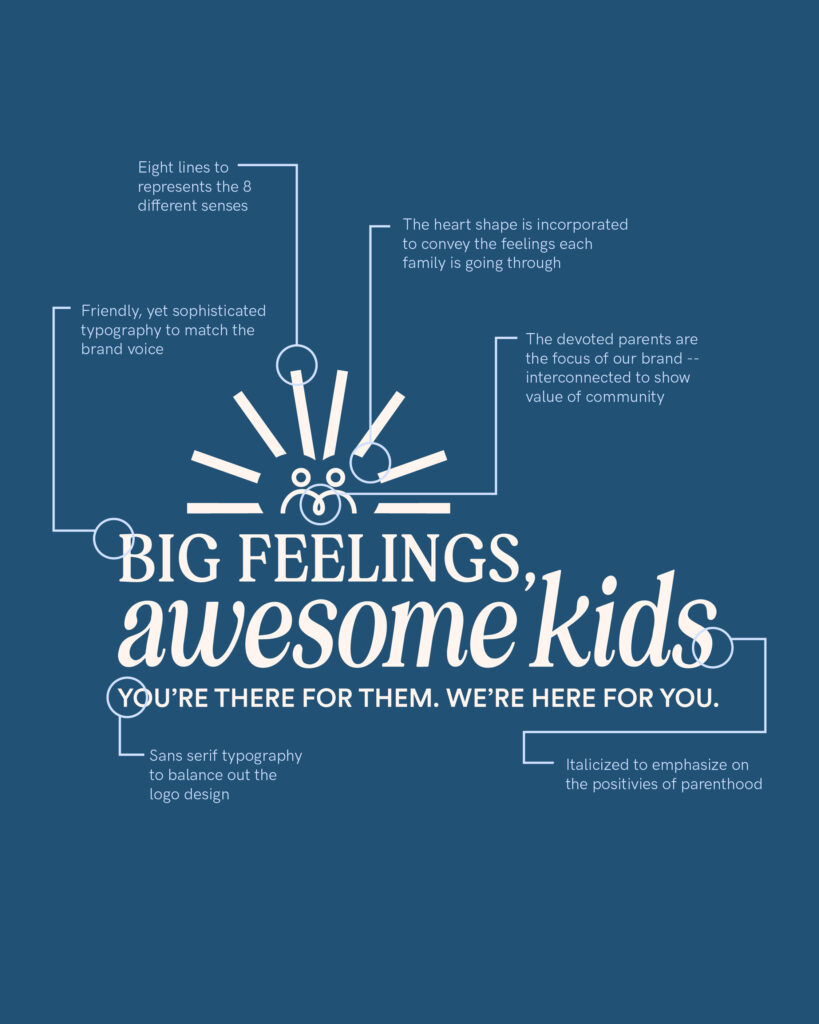
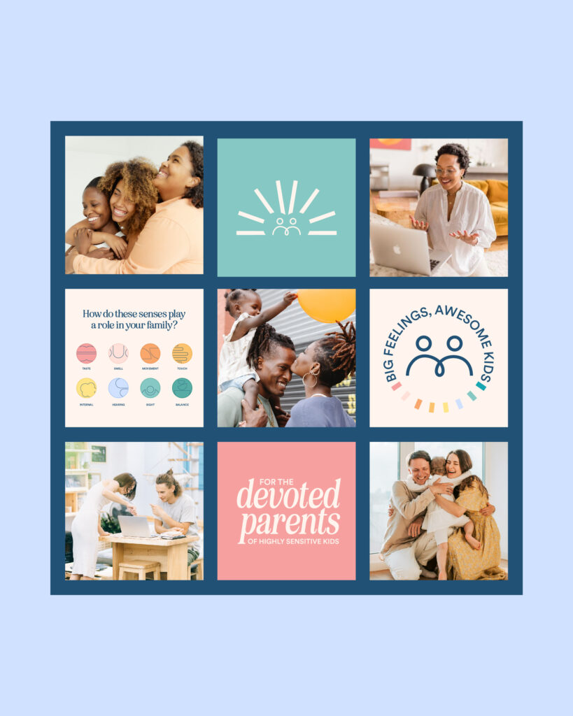
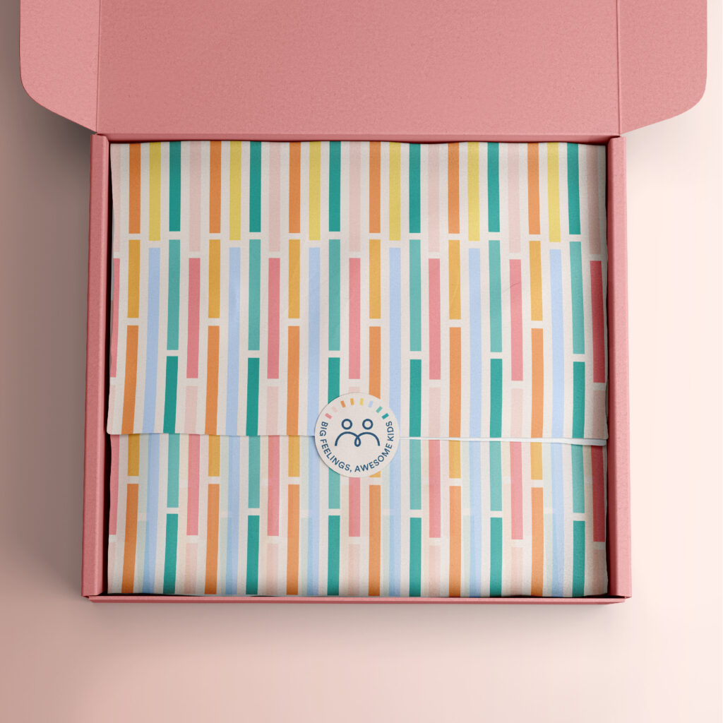
When you invest in a full brand identity, you get way more than just a logo. You get loads of brand assets you can use across multiple platforms.
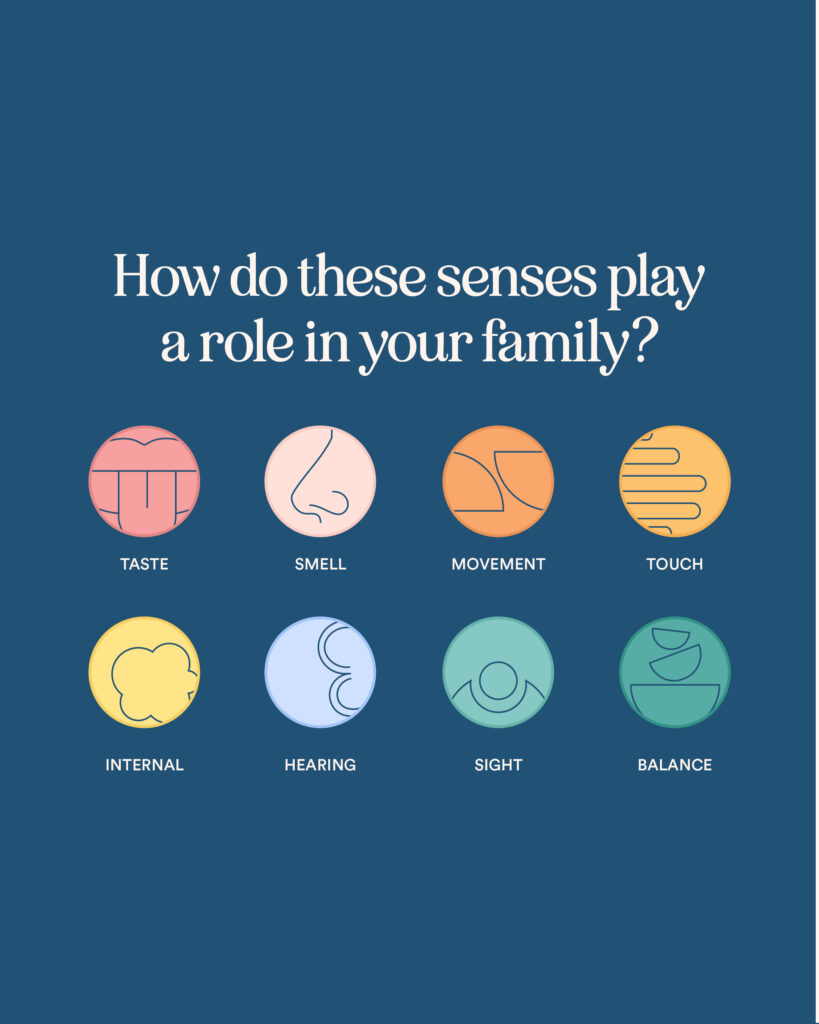
From brand patterns to use in packaging, newsletter signs ups, Instagram highlight covers to brand marks to add in some personalized touches to your website!
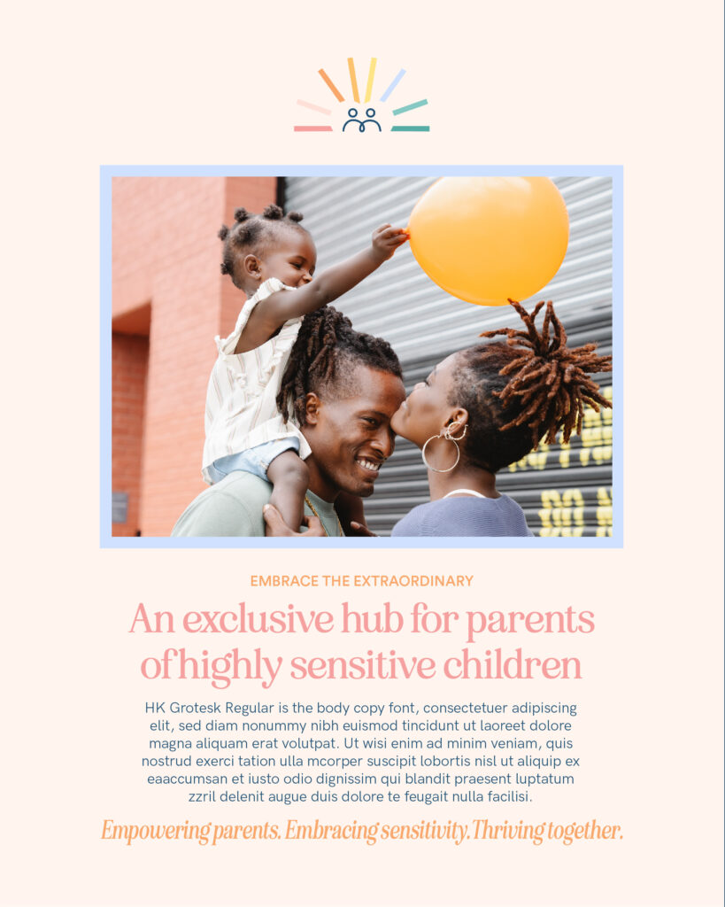
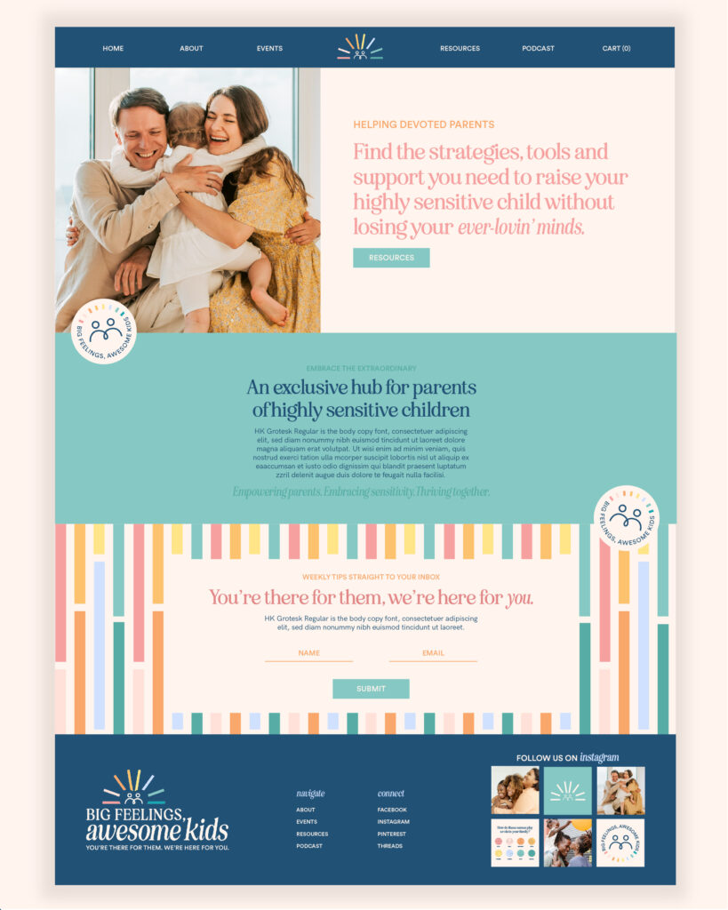
And because I just loveeee designing websites, I designed a lil’ mockup of what the Big Feelings, Awesome Kids website could look like.
Of course the home page would normally have way more info on it like an about section, services, etc. but this is just for fun 😉
Ready to have your own rave-worthy brand identity?
Looks like you came to the right place! Hi, I’m Cagney! A bold, personality-packed brand and web designer who loves working with passionate creatives like you.
